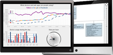
Quantcast
Channel: ComponentSource News | Chart Components
Viewing all 2852 articles
Browse latest View live

MindFusion.Java Swing Pack 2019.R1

$
0
0
MindFusion.Java Swing Pack

Diagramming adds Button, CheckBox, Edit, NumericEdit, Slider and Spinner CompositeNode components.

Features

  • JavaFX dependencies removed from all components in the pack.
  • Diagramming for Java Swing
    • New CompositeNode components - Component classes that support user interaction can now be used as part of CompositeNode templates:
      • ButtonComponent implements clickable buttons inside nodes.
      • CheckBoxComponent represents a check-box that lets users select true / false values.
      • EditComponent implements editable text area.
      • NumericEditComponent implements number-entry area.
      • SliderComponent allows selecting a value from numerical range by dragging a slider.
      • SpinnerComponent represents a spin-edit component.
    • Improved FlowchartLayout - FlowchartLayout can now arrange more types of graphs, no longer requiring them to represent strictly-nested source code structures.
  • Spreadsheet for Java Swing
    • The Editable property added to Cell class lets you prevent users from changing cell's content.
    • Show rotated cell text by setting the Rotation style property.
    • Show double underlined cell text by setting the FontDoubleUnderline style property.
    • Prevent users from resizing rows and columns by setting the AllowResizeHeaders property.
    • The inplaceEditStarting event is now raised by the formula bar too.
    • CSV importer fixes.
  • MindFusion Virtual Keyboard
    • Added dispose method used to stop the auto-repeat timer. Calling it is necessary if disposing the parent frame in response to keyboard's own key-press event.
    • Setting the TemplateLayout property now automatically changes Mode to Custom.

Actipro WPF Studio 2018.1 build 0676

$
0
0
Actipro WPF Studio

Improves Docking/MDI, Editors and SyntaxEditor controls.

Features

Docking/MDI

  • Added the DockingWindowDefaultLocationEventArgs.FloatingLocation property that specifies the floating location of the docking window when e.ShouldFloat is set in a DockSite.WindowDefaultLocationRequested event handler.
  • Improved the cleanup of open document references.
  • Improved key processing to allow child controls to handle keys like Esc, thereby preventing the dock site from handling them.
  • Improved the DockSite.PrimaryDocumentChanged event to not fire until the end of a batch MVVM items source update.

Editors

  • Added an IsUndoEnabled property to all edit boxes, determining whether undo/redo support is enabled for the text-editing portion of the controls.
  • Updated TimeEditBox to not change the date portion of the value when parsing typed text or spinning.

Grids

  • Updated the PropertyGrid.MiscCategoryName property to return a localized version of the 'Misc' text by default.

Ribbon

  • Added the Tab.UseColors property that is set appropriately by each theme via a new AssetResourceKeys.ContextualTabUseColorsBooleanKey resource.
  • Updated how the Tab.IsSelected property is implemented.
  • Updated the PopupControlService logic for attempting to focus the first focusable child control on an opened popup.
  • Improved the ability of buttons to coerce a default checkable command parameter when the Command property is set.

SyntaxEditor

  • Added handling for any possible system exceptions that could arise from clipboard access.
  • Optimized tag aggregators to not raise a TagsChanged event when refreshing if there were no taggers before or after the refresh.
  • .NET Languages Add-on
    • Improved lock access to the assembly repository across multiple threads.

Fixes

Docking/MDI

  • Fixed a bug that could prevent context menus on child controls from opening in a certain scenario.
  • Fixed a bug where adding a docking window via MVVM with IsActive set to true might not result in the docking window being selected.
  • Fixed a bug where an exception could be throw when right-clicking within a popup anchored in an AdvancedTabControl.
  • Fixed a bug where the correct tab might not be activated properly after doing a batch MVVM items source update.

Editors

  • Fixed a bug where the MonthCalendar would disable a date if the Minimum is set to that date but with a time after midnight.

Grids

  • Fixed a memory leak that could occur when refreshing the children of a collapsed TreeListBox node.

Ribbon

  • Fixed a bug where an in-ribbon gallery might not properly configure variants initially in a certain scenario.
  • Fixed a bug where an in-ribbon gallery that can auto-size might not expand properly as items are added dynamically.
  • Fixed a couple bugs with contextual tab borders not always rendering correctly when used with minimized popups.

Themes

  • Fixed a bug in WindowChrome that could prevent a maximized window from restoring to its previous bounds in a certain situation.

BCGSuite for MFC v30.0

$
0
0
BCGSuite for MFC

Adds support for Visual Studio 2019, plus new features for chart, dialog, grid and report components.

Features

  • Microsoft Visual Studio 2019 support:
    • The source files are fully compliant with Visual 2019 C++ compiler.
    • All examples and samples were thoroughly tested with VS 2019.
    • Evaluation version contains DLLs and libraries required for VS 2019.
  • Dialogs and Forms
    • A new class CBCGPScrollDialog implements a dialog box with scrolling support.
    • CBCGPFormView: added automatic scrolling when a newly focused control exceeds form's bounds.
    • CBCGPPropertySheet: added custom (owner-draw) notification badges support.
  • Chart Control
    • Implemented drawing of partially visible data points for a fixed interval width. New methods EnableAllUnitsOnFixedInterval and IsAllUnitsOnFixedInterval were added to CBCGPChartAxis class.
    • A new method ValueFromPoint was added to CBCGPChartTernaryAxis class.
    • CBCGPChartSurfaceSeries::ColorMode enumerator has a new member: CM_SERIES: when this mode is specified, each series is drawn in one color, which is defined by the currently selected theme or by user.
  • Grid and Report Controls
    • CBCGPGridItem: added hot-tracking support. Override a new 'IsHotTrackEnabled' method in your CBCGPGridItem-derived class and return TRUE to enable grid cell mouse tracking.
    • CBCGPGridCheckItem: added grid control modes ("Check box" or "Switch"). New methods SetMode and GetMode were added to this class.
    • Implemented a special row marker for the Grid cell editing mode: when row is selected and one of the cells is being edited, a special marker (pencil) is displayed on the left side. New method CBCGPGridCtrl::SetRowHeaderEditImage allows to specify this symbol. In addition, you may draw your own marker by overriding new method CBCGPGridCtrl::OnDrawRowHeaderEditImage.
  • Controls
    • CBCGPDateTimeCtrl: added WM_GETTEXT message processing. A result of this message is formatted date and time value of this control.
    • A new class CBCGPIPAddressCtrl implements themed IP Address control.
    • CBCGPListBox: new method MoveItem allows to change an existing list box item position (index).
    • New class CBCGPDragListBox implements a list box that allows users to move items within the control. Generally, this control is very similar to MFC CDragListBox, but it has visual themes support and other CBCGPListBox features such as pinned items support, color bars and others.
    • CBCGPSliderCtrl: introduced a new "progress" mode. In this mode, the channel area left of the slider's thumb is filled with some (default or user-defined) color.
    • CBCGPGroup: implemented group caption check box / radio button. When user "unchecks" the group, all controls located within the group bounds will be automatically disabled. SetCheckRadioStyle, GetCheckRadioStyle, SetCheck and GetCheck methods were added to CBCGPGroup class.
  • Miscellaneous
    • CBCGPCalendar::IsDateMarked method is virtual now: override it if you wish to mark specific calendar's date without calling MarkDates method.
    • New virtual method CBCGPCalendar::OnClickTodayButton is called when user clicks "Today" button on the calendar.
    • CBCGPEditCtrl: added visual theme-dependable bookmarks.
  • Examples and Samples
    • BCGPGridExample: added demonstration how to add switch control and custom rating control to the grid.
    • ListBoxDemo: demonstrates a new CBCGPDropListBox class.
    • PropSheetDemo: demonstrates owner-draw notification badges.
    • ResizableForm: added slider controls in a progress mode demonstration.
    • New sample application ScrollDialogDemo demonstrates how to use a new class CBCGPScrollDialog.
    • New sample application GroupBoxDemo demonstrates how to add check box and radio button to the group box control.

Fixes

  • CBCGPGraphicsManagerD2D: addressed issue with incorrectly created stroke style in some cases.
  • CBCGPListBox: addressed issue with incorrectly painted list box item when control has "Right Align" style.
  • CBCGPPropertySheet: addressed issue with repainting of the separator located below the wizard buttons after property sheet was resized (Wizard mode only).
  • CBCGPStatic: addressed issue with calling SetPicture multiple times. In this case, a previously loaded image is properly cleared.
  • CBCGPSwitchCtrl correctly processes BCGM_ONSETCONTROLVMMODE registered message now.
  • CBCGPVisualManager: addressed switch control drawing issue in some visual themes.
  • Chart: addressed issue with incorrect surface series rendering in case of CBCGPChartSurfaceSeries::CM_SINGLE color mode when a number of color levels is 1.
  • CBCGPPlannerViewSchedule: addressed issue with incorrect size for all-day appointments that have duration of more than one day.
  • CBCGPPropertyPage: addressed issue with incorrect header width in some cases.
  • Visual container and control: fixed incorrect position and layout of the visual container items after printing or exporting.
  • CBCGPGridCtrl: addressed some issues with a grid horizontal scrolling.

BCGControlBar Library Professional Edition MFC v30.0

$
0
0
BCGControlBar Library Professional Edition MFC

Adds support for Visual Studio 2019, plus new features for chart, dialog, grid and report components.

Features

  • Microsoft Visual Studio 2019 support:
    • The source files are fully compliant with Visual 2019 C++ compiler.
    • All examples and samples were thoroughly tested with VS 2019.
    • Evaluation version contains DLLs and libraries required for VS 2019.
  • Frame Windows
    • Frame windows with a themed non-client area are created with WS_CAPTION style now. This change addresses many issues such as:
      • Incorrect multi-monitor support.
      • Incomplete side-by-side behavior.
      • Frame resizing performance.
  • Dialogs and Forms
    • A new class CBCGPScrollDialog implements a dialog box with scrolling support.
    • CBCGPFormView: added automatic scrolling when a newly focused control exceeds form's bounds.
    • CBCGPPropertySheet: added custom (owner-draw) notification badges support. Override new virtual method 'OnDrawPageNotificationBadge' to draw your custom badge (see PropSheetDemo sample).
  • Docking Panes
    • CBCGPDockingControlBar: implemented ability to specify pane's caption depending on the current state. For example, you can add a name of the currently selected object on the properties grid caption.
    • New global flag CBCGPOutlookButton::m_bDrawAmpersand specifies whether button's label should be drawn with underlined character or ampersand before this character. By default, the label is drawn with underlined character.
    • CBCGPStatusBar: implemented status bar pane notification badge support.
  • Chart Control
    • Implemented drawing of partially visible data points for a fixed interval width. New methods EnableAllUnitsOnFixedInterval and IsAllUnitsOnFixedInterval were added to CBCGPChartAxis class.
    • A new method ValueFromPoint was added to CBCGPChartTernaryAxis class.
    • CBCGPChartSurfaceSeries::ColorMode enumerator has a new member: CM_SERIES: when this mode is specified, each series is drawn in one color, which is defined by the currently selected theme or by user.
  • Visual Manager and Themes
    • A control's description (usually located below control's label) has a special color now. A new method 'GetDescriptionTextColor' was added to CBCGPVisualManager class.
    • CBCGPVisualManagerVS2019: changed visual theme colors to match VS 2019 release (Light blue theme).
  • Grid and Report Controls
    • CBCGPGridItem: added hot-tracking support. Override a new 'IsHotTrackEnabled' method in your CBCGPGridItem-derived class and return TRUE to enable grid cell mouse tracking.
    • CBCGPGridCheckItem: added grid control modes ("Check box" or "Switch"). New methods SetMode and GetMode were added to this class.
    • Implemented a special row marker for the Grid cell editing mode: when row is selected and one of the cells is being edited, a special marker (pencil) is displayed on the left side. New method CBCGPGridCtrl::SetRowHeaderEditImage allows to specify this symbol. In addition, you may draw your own marker by overriding new method CBCGPGridCtrl::OnDrawRowHeaderEditImage.
  • Desktop Alert Window
    • CBCGPPopupWindow: improved colors of BCGPPopupWindowTheme_Black theme.
    • CBCGPPopupWindow: if window transition effect is CBCGPPopupMenu::SLIDE and desktop alert should appear on the left or right screen side, the sliding will be horizontal.
  • Controls
    • CBCGPDateTimeCtrl: added WM_GETTEXT message processing. A result of this message is formatted date and time value of this control.
    • A new class CBCGPIPAddressCtrl implements themed IP Address control.
    • CBCGPListBox: new method MoveItem allows to change an existing list box item position (index).
    • New class CBCGPDragListBox implements a list box that allows users to move items within the control. Generally, this control is very similar to MFC CDragListBox, but it has visual themes support and other CBCGPListBox features such as pinned items support, color bars and others.
    • CBCGPSliderCtrl: introduced a new "progress" mode. In this mode, the channel area left of the slider's thumb is filled with some (default or user-defined) color.
    • CBCGPGroup: implemented group caption check box / radio button. When user "unchecks" the group, all controls located within the group bounds will be automatically disabled. SetCheckRadioStyle, GetCheckRadioStyle, SetCheck and GetCheck methods were added to CBCGPGroup class.
  • Miscellaneous
    • Implemented ability to enable "Press and Hold" gesture event for all library controls: by default, this event is disabled for the performance reasons, but you can enable it now by setting globalData. m_bTabletDisablePressAndHold to FALSE.
    • CBCGPCalendar::IsDateMarked method is virtual now: override it if you wish to mark specific calendar's date without calling MarkDates method.
    • New virtual method CBCGPCalendar::OnClickTodayButton is called when user clicks "Today" button on the calendar.
    • CBCGPEditCtrl: added visual theme-dependable bookmarks.
    • CBCGPPropList: implemented items button custom color. New methods SetItemButtonColor and GetItemButtonColor were added.
    • CBCGPWinApp class overrides DoMessageBox method and displays a themed message box (BCGPMessageBox) instead of the standard message box.
    • CBCGPAppOptions structure has a new member m_bMDITabsDocumentMenu: specifies whether MDI tabs have a documents button located right of tabs.
    • Added a new registered message BCGM_GETCOLORTOOLTIP. The message is sent to the main application frame when a color box's tooltip is being formatted.
  • Examples and Samples
    • BCGPControls: added IP Address control and Property Grid button custom color demonstrations.
    • BCGPVisualStudioGUIDemo: demonstrates new features of the editor markers.
    • BCGPGridExample: added demonstration how to add switch control and custom rating control to the grid.
    • ListBoxDemo: demonstrates a new CBCGPDragListBox class.
    • PropertyGridMDIDemo: added demonstration how to customize a docking pane caption.
    • PropSheetDemo: demonstrates owner-draw notification badges.
    • ResizableForm: added slider controls in a progress mode demonstration.
    • New sample application ScrollDialogDemo demonstrates how to use a new class CBCGPScrollDialog.
    • StatusBarDemo: demonstrates status bar pane notification badge.
    • New sample application GroupBoxDemo demonstrates how to add check box and radio button to the group box control.

Fixes

  • CBCGPGraphicsManagerD2D: addressed issue with incorrectly created stroke style in some cases.
  • CBCGPKeyMapDlg: addressed issue with incorrectly filled key list if main application frame has an advanced frame caption pane.
  • CBCGPListBox: addressed issue with incorrectly painted list box item when control has "Right Align" style.
  • CBCGPPopupMenu: addressed issue with a first menu item repainting after the scrolling performed by the mouse wheel.
  • CBCGPPropertySheet: addressed issue with repainting of the separator located below the wizard buttons after property sheet was resized (Wizard mode only).
  • CBCGPRibbonBar: addressed issue with QAT icons color when Ribbon bar doesn't replace the frame caption (in some visual themes such as Office 2016 colorful or dark gray).
  • CBCGPRibbonCategory::GetImageSize returns now a default image size when a Ribbon category (tab) doesn't have a corresponding image list.
  • CBCGPRibbonComboBox: addressed issue with foreground color of control located on the Ribbon tabs row (in some visual themes when tabs area has a dark background).
  • CBCGPStatic: addressed issue with calling SetPicture multiple times. In this case, a previously loaded image is properly cleared.
  • CBCGPSwitchCtrl correctly processes BCGM_ONSETCONTROLVMMODE registered message now.
  • CBCGPVisualManager: addressed switch control drawing issue in some visual themes.
  • Chart: addressed issue with incorrect surface series rendering in case of CBCGPChartSurfaceSeries::CM_SINGLE color mode when a number of color levels is 1.
  • CBCGPPlannerViewSchedule: addressed issue with incorrect size for all-day appointments that have duration of more than one day.
  • CBCGPPropertyPage: addressed issue with incorrect header width in some cases.
  • CBCGPScrollBar: addressed issue with internal control rendering in some cases.
  • CBCGPTooltipManager: optimized tooltips memory management.
  • Visual container and control: fixed incorrect position and layout of the visual container items after printing or exporting.
  • CBCGPGridCtrl: addressed some issues with a grid horizontal scrolling.

Actipro WPF Studio 2019.1

$
0
0
Search Overlay Pane

Massive SyntaxEditor enhancements and updates.

Features

Cross-Platform Design

  • The internals of SyntaxEditor have been heavily refactored to support a cross-platform API across the WPF, UWP and WinForms platforms. This allows SyntaxEditor features for the three platforms to be kept in sync moving forward. The 2019.1 UWP and WinForms versions of SyntaxEditor will follow later this year.

Carets and Selection

  • Multiple Selections
    • Multiple selections, each with their own caret, are now supported. A new selection can be added by holding the Ctrl key when clicking in the text area or clicking on the selection or line number margins.  Most edit actions have been refactored to fully support multiple selections. For instance, pressing Shift+Right Arrow will extend all of the selections by one character.
    • Copying text from multiple selections unions the selected text, joining each range's text with a line terminator.  Pasting multi-line text into a view with the same number of selections as text lines being pasted will replace each selection with a related line from the pasted text.
  • Touch Selection Grippers - Selection grippers will show for the primary selection when touch input is used.
  • Caret Movement
    • Carets now support movement at both the start and end of word wrapped lines.
    • Virtual space is now supported at the end of lines when a new option is enabled. Block selections can be made in virtual space at the end of lines, even without line end virtual space being enabled. This prevents the caret from snapping to an offset when making a block selection, which can sometimes be problematic.

Search Overlay Pane

  • A new search overlay pane displays over the upper-right of the active editor view when Ctrl+F (find mode) or Ctrl+H (replace mode) are pressed in a multi-line editor. A toggle mode button on the search overlay pane switches between find and replace modes, and all common search options are supported via toggle buttons and other controls. The search overlay pane can be closed by clicking the X button or by pressing Esc.
  • Ctrl+F3 will open the search overlay pane without focusing it, and will search forward for the currently-selected text. Ctrl+Shift+F3 will do the same but will search backwards.
  • F3 will search for the next match of the previously-used search options. Shift+F3 will search for the previous match of the previously-used search options.
  • If the SyntaxEditor.IsSearchResultHighlightingEnabled property is true, the search results can be highlighted while the search overlay pane is open. Closing the search overlay pane, clears the search result highlights.

IntelliPrompt

  • Vector Images - The Metro Light and Metro Dark common image sets are now in vector form and render beautifully in high DPI.
  • Completion Filters - Completion filters have been updated so when there are multiple active filters with the same ICompletionFilter.GroupName, any one of those filters can includes an item.  Toggle button completion filters were changed to appear unchecked when they aren't active, which is more natural.
  • Ctrl Key Opacity Changes - The logic for making IntelliPrompt popups and the new search overlay pane semi-transparent when the Ctrl key is held has been refactored and improved.  A brief delay was added before the opacity change occurs.

Splitting

  • The scrollbar splitter button now has a larger appearance.
  • The view splitter can be dragged to the bottom of the view to remove the split and keep the top view.

Scrolling and Zooming

  • Touch Scrolling - Smooth inertia-based touch scrolling has been added.
  • Auto ScrollBar Visibility - The horizontal and vertical scrollbars now support an Auto visibility option that will only display then when necessary.
  • Horizontal Scrolling
    • Editor views can be scrolled horizontally with Shift+MouseWheel.
    • Better logic was implemented for managing horizontal scroll maximums, especially when scrolling vertically.
  • Scroll API - New programmatic scroll methods were added that allow for aligning an anchor line to the top/center/bottom of a view with a specified pixel displacement, or scrolling by pixels.

Margins

  • Line Number Customization - A new line number provider language service was added that allows for complete customization of how line numbers are rendered in the line number margin. In addition, a property was added to the document that sets the line number for the first line in the document, defaulting to one.
  • Indicator Glyphs - The rendering of built-in indicator glyphs was improved.

Text Rendering

  • The text rendering of long lines was improved.

.NET Languages Add-on

  • IntelliPrompt completion list toggle button filters were added for the various kinds of items displayed in the list. The IntelliPrompt completion filter UI (toggle buttons and tabs) only shows based on the available items in the unfiltered list. For instance, if there are no types in the list, no 'Types' toggle button filter is visible.
  • Roslyn Add-on - The optional Roslyn add-on was updated to use Roslyn v3.0.0.

Python Language Add-on

  • IntelliPrompt completion list toggle button filters were added for the various kinds of items displayed in the list. The IntelliPrompt completion filter UI (toggle buttons and tabs) only shows based on the available items in the unfiltered list. For instance, if there are no classes in the list, no 'Classes' toggle button filter is visible.

ANTLR Add-on

  • The ANTLR add-on was updated to use ANTLR v3.5.1.

Irony Add-on

  • The Irony add-on was updated to use Irony v1.1.

Wijmo Enterprise 2019 v1 (Build 612)

$
0
0
Wijmo Enterprise

Adds support for Angular 8, plus improvements to FlexChart and FlexGrid.

Features

  • Added support for Angular 8.
  • Added support for deep-binding in wijmo.format method.
  • Added FlexChart.itemsSourceChanging/Changed events.
  • Added FlexGrid.refreshRange method for finer control on rendering.
  • New Samples
    • GanttChart Repeat Tasks - PureJS | Angular | React | Vue
    • FlexGrid PDF Export WebWorkers - React
    • TemplateLiterals - PureJS | Angular | React | Vue
    • Gauge NeedlePointer - PureJS | Angular | React | Vue

Wijmo Core 2019 v1 (Build 612)

$
0
0
Wijmo Core

Adds support for Angular 8, plus improvements to FlexChart and FlexGrid.

Features

  • Added support for Angular 8.
  • Added support for deep-binding in wijmo.format method.
  • Added FlexChart.itemsSourceChanging/Changed events.
  • Added FlexGrid.refreshRange method for finer control on rendering.
  • New Samples
    • GanttChart Repeat Tasks - PureJS | Angular | React | Vue
    • FlexGrid PDF Export WebWorkers - React
    • TemplateLiterals - PureJS | Angular | React | Vue
    • Gauge NeedlePointer - PureJS | Angular | React | Vue

FusionCharts Suite XT v3.13.5

$
0
0
FusionCharts Suite XT

Multi-level pie chart 'ShowLabel' and 'ShowValue' attributes are now supported at category level.

Features

  • In a multi-level pie chart, 'showLabel' and 'showValue' attributes are now supported at the 'category'level.
  • The file format to export a chart in Excel is now changed from '.xls' to '.xlsx'.

Fixes

  • In a multi-series chart, if a series is hidden at the time of rendering and the attribute 'transposeAxis'is set as '1', the y-axis was not scaling properly. This issue is now fixed.
  • On exporting charts as PDF from a page which has multiple charts, the exported PDF was not opening properly in other applications, e.g.,- Acrobat Reader. This issue is now fixed.
  • In a multi-series chart, if a series is hidden at the time of rendering by setting the 'visible' attribute to '0', the chart was throwing a 'JS' error. This issue is now fixed.
  • 'connectNullData' is now working fine in spline and multi-series spline charts.
  • In a multi-axis line chart with more than 9 series, a 'JS' error was thrown on hovering over the legend. This issue is now fixed.
  • The horizontal bullet chart was throwing a 'JS' error and disappear when resized. This issue is now fixed.
  • In IE8, charts were not rendering when using the minified version of the jQuery plugin. This issue is now fixed.
  • Annotation image and logo are now appearing in Android Chrome.
  • In the Treemap chart, if the plot animation was turned on, the navigation bar was visible on rendering the chart. This issue is now fixed.
  • The animation was not working while rendering the chart if an image annotation was present. This issue is now fixed.
  • 'removeMarker()' API is now working fine. Previously, it was throwing a js error.
  • The 'destroy()' and 'hide()' APIs are now working as intended. Previously, they were throwing 'JS' errors.
  • In multi-series dual Y-axis combination chart, the tooltip of the line chart was not visible on hover. This issue is now fixed.
  • The text alignment in the legend was not working properly if the attribute 'hasRTLText' attribute was set to 1. This issue is now fixed.
  • In the multi-series column chart, the legend drag feature is now working as expected. Previously, if the chart was updated with the same data the legend drag was not working.
  • If there were multiple draggable charts in a page, setting the Y-axis limit manually on any chart changed the Y-axis limit of the last chart automatically. This issue is now fixed.

Telerik UI for Xamarin R2 2019 (2019.2.603.360)

$
0
0
Telerik UI for Xamarin

Improves scrolling performance for PDF Viewer, plus updates for Calendar and ListView.

Features

  • Calendar
    • Introduced helper class to serialize/deserialize recurrence patterns to iCalendar format.
  • ListView
    • TabView: Introduced a new property IsContentPreserved to control whether to preserve tab content when switching between tabs.
  • PDF Viewer
    • Improved scrolling performance.

Fixes

  • Common
    • Crash when upgrading to Xamarin.Forms 4.0.
  • AutoCompleteView
    • Unfocused event is not raised.
  • Calendar
    • [Android] SelectionChanged is triggered twice when changing the appointments collection at runtime.
    • [iOS] Day View Events View permanently shifts when changing view mode while swiping left/right.
    • Changed SelectionChanged event args to be of type CalendarSelectionChangedEventArgs that includes AddedItems and RemovedItems properties.
  • CheckBox
    • IsChecked property is not updated when default binding mode is used.
  • DataGrid
    • [iOS] A NullReferenceException is thrown when trying to load the telerik font.
  • ListView
    • [iOS] Entry in ListViewTemplateCell is overlapped by keyboard.
    • [Android] TextCell is not centered vertically.
    • [Android] NullReferenceException is thrown on item property change when ItemStyleSelector is applied.
    • Binding is lost when ItemTemplateSelector is used and templates are switched dynamically.
    • [Android] Items are not loaded after second LoadOnDemandItemTemplate is tapped.
  • NumericInput
    • [Android] Value is not applied correctly when StringFormat property is used.
  • Popup
    • [iOS] The popup is misplaced when a picker items are displayed.
  • TreeView
    • [iOS] Unexpected behavior when ItemsSource is cleared or updated at runtime.
    • Calling ScrollItemIntoView() leads to exception.

KWizCom Charts for SharePoint Web Part v15.1.41

$
0
0
KWizCom Charts for SharePoint Web Part

Adds cache to handle very big lists.

Features

  • Added: add cache to handle very big lists.

DevExpress VCL Subscription 18.2.8

$
0
0
DevExpress VCL Subscription

Improves Grid, VerticalGrid, SpreadSheet & PivotGrid controls, plus the PDFViewer, RichEdit & Scheduler controls.

Fixes

ExpressBars Suite

  • TdxBarCustomPopupMenu and descendants - A bar's popup menu is always scaled according to the monitor DPI, even if the menu's invoker is programmatically scaled to a different target DPI.
  • TdxRibbonStatusBar - An AV occurs when an editor on the status bar's toolbar panel receives focus if the Ribbon property is set to nil.
  • TdxStatusBar - The font of an individual panel scales twice if the panel's PanelStyle.ParentFont property is set to True, and the system DPI does not equal 96.
  • TdxTabbedMDIManager - A child MDI form's TdxRibbon control is displayed on the form for a brief moment before being merged with the parent form's TdxRibbon control on switching between MDI child forms.

ExpressDataController

  • Server Mode - A column whose Properties property is incorrectly unassigned displays certain non-string data types.

ExpressEditors Library

  • cxLabel - An editor is scaled incorrectly if it is anchored to the right edge of its parent and has an associated style controller.
  • cxLookupComboBox - The EditValue property value can change to Null Variant if the Properties.DropDownListStyle property is set to lsFixedList, and the ifoUseContainsOperator flag is in the Properties.IncrementalFilteringOptions property value.
  • Increasing the Filter Builder dialog's font size displays a horizontal scrollbar.
  • TcxCustomTextEdit and descendants - The CursorPos property returns an incorrect value in certain cases.
  • TcxDBRichEdit - An entire editor content becomes selected when the Style.Color property value changes.

ExpressLibrary

  • SVG Images - Certain images in a 64-bit application are parsed incorrectly.
  • The dxSetProcessDpiAwareness global function in the dxDPIAwareUtils unit does not work under Windows 10 version 1607 and newer.

ExpressPDFViewer

  • A text can be invisible if it uses a custom-encoded PostScript Type 1 embedded into a loaded document.
  • Incorrect font glyphs are displayed for characters in a text that uses an embedded font whose 'hhea' table is omitted.
  • The default button field states are displayed incorrectly for the fields whose values are unspecified in a loaded PDF document.

ExpressPivotGrid Suite

  • Data fields have incorrect widths if the "TheBezier" skin is applied.

ExpressQuantumGrid Suite

  • Chart View - NULL grouped chart values cannot be drilled down.
  • cxExtLookupComboBox - An AV occurs on closing an in-place editor's dropdown window with filtered items if the TcxGrid control uses hybrid scrollbars.
  • Table and Banded Table Views - Horizontal scrolling cannot bring certain columns into view if the View's OptionsView.ColumnAutoWidth property is set to True and the Options.AutoWidthSizable property is set to False for one or more columns.

ExpressQuantumTreeList Suite

  • The ikMultiArrow indicator cell icon is not displayed for a focused node that is the only node selected in the tree list.

ExpressRichEdit Control

  • An HTML document is loaded very slowly if it contains a link whose URL does not specify a protocol.
  • Opening a DOCX file that contains a duplicate or empty xmlns attribute causes the "Duplicates not allowed" error.

ExpressScheduler Suite

  • An event doesn't assign its Data property on calling the event's Assign method.
  • Events are hidden for resources if certain non-matching strings are assigned as their identifiers.

ExpressSpreadSheet

  • A custom in-place cell editor that overrides the default editor via an OnEditing event handler, scales twice when invoked for the first time on a monitor whose DPI differs from 96.
  • A defined name that refers to an external document is loaded incorrectly from an XLS file.
  • A worksheet ceases to scroll on cell selection via drag-and-drop when the mouse pointer goes outside the control's bounds if the worksheet has at least one frozen row or column.
  • An AV occurs on an attempt to copy or cut a cell to the clipboard if the cell contains a formula expression that returns a string.
  • Certain cell borders are not displayed in certain spreadsheet documents created by third-party applications.
  • Export to XLSX - Microsoft Excel considers an exported document corrupted if a worksheet has one or more hyperlinks and its OptionsPrint.Source.GridLines property is set to bTrue or bFalse.
  • The "'-' is not a valid floating point value" exception occurs on loading an ODS file that includes at least one blank cell with a numeric formatting pattern.
  • The IF function returns only a single value regardless of accepted parameters.
  • The IF, IFERROR, IFNA, and CHOOSE functions can return incorrect results when used in array formula expressions that return an array.

ExpressVerticalGrid Suite

  • TcxVirtualVerticalGrid - The "List index out of bounds (-1)" exception occurs on saving a stream using its WriteComponent method if no record is focused.

Telerik UI for Blazor 1.1.1

$
0
0
Telerik UI for Blazor

Includes updates for Grid, DatePicker and TabStrip.

Features

  • Common
    • Migrate online demos to server-side Blazor.
    • Web Installer and Control Panel are now available.

Fixes

  • Grid
    • Upon CommandButton click "Object reference not set to an instance of an object." is thrown in the console.
  • DatePicker
    • DatePicker throws exception upon selecting a date in a server-side scenario.
  • TabStrip
    • Rename RemoveTab() to DeactivateTab() to reflect the actual purpose of the method.

Telerik UI for Blazor is available as a standalone product and is also included in the following Telerik products:

  • Telerik DevCraft Ultimate
  • Telerik DevCraft Complete
  • Telerik DevCraft UI

Highcharts Suite v7.1.2

$
0
0
Highcharts Suite

Includes new vertically scrollable plot area, plus options in Highstock JS to control rendering lines across all panes.

Features

  • New in Highstock 7.1.2
    • Added new options plotBands.acrossPanes and plotLines.acrossPanes to control rendering lines across all panes.
  • New in Highcharts Basic 7.1.2
    • Added new feature, vertically scrollable plot area.
      This adds native scrolling features vertically, and is enabled using the chart.scrollablePlotArea.minHeight setting.
    • Deprecated the 'labels' option in favor of 'annotations'.
    • Added stack labels feature to waterfall series.
    • Added auto alignment for solid gauges with two labels.
    • Improved performance for exporting packedbubble series.
    • Added 'series.nodes[index].remove()' method to networkgraph series to remove a node with all connected links.
    • Added support for percentage value in yAxis.labels.distance option for gauge series.

Highcharts JS v7.1.2

$
0
0
Highcharts JS

Adds a new feature to vertically scroll plot area, plus improvements for waterfall and packedbubble chart series.

Features

  • Added new feature, vertically scrollable plot area.
    This adds native scrolling features vertically, and is enabled using the chart.scrollablePlotArea.minHeight setting.
  • Deprecated the 'labels' option in favor of 'annotations'.
  • Added stack labels feature to waterfall series.
  • Added auto alignment for solid gauges with two labels.
  • Improved performance for exporting packedbubble series.
  • Added 'series.nodes[index].remove()' method to networkgraph series to remove a node with all connected links.
  • Added support for percentage value in yAxis.labels.distance option for gauge series.

Highstock JS v7.1.2

$
0
0
Highstock JS

Adds new options to control rendering lines across all panes, plus a vertically scrollable plot area.

Features

  • New in Highstock 7.1.2
    • Added new options plotBands.acrossPanes and plotLines.acrossPanes to control rendering lines across all panes.
  • New in Highcharts Basic 7.1.2
    • Added new feature, vertically scrollable plot area.
      This adds native scrolling features vertically, and is enabled using the chart.scrollablePlotArea.minHeight setting.
    • Deprecated the 'labels' option in favor of 'annotations'.
    • Added stack labels feature to waterfall series.
    • Added auto alignment for solid gauges with two labels.
    • Improved performance for exporting packedbubble series.
    • Added 'series.nodes[index].remove()' method to networkgraph series to remove a node with all connected links.
    • Added support for percentage value in yAxis.labels.distance option for gauge series.

Highcharts Gantt JS v7.1.2

$
0
0
Highcharts Gantt JS

Adds new feature to vertically scroll plot area, plus improvements for waterfall and packedbubble chart series.

Features

  • Added new feature, vertically scrollable plot area.
    This adds native scrolling features vertically, and is enabled using the chart.scrollablePlotArea.minHeight setting.
  • Deprecated the 'labels' option in favor of 'annotations'.
  • Added stack labels feature to waterfall series.
  • Added auto alignment for solid gauges with two labels.
  • Improved performance for exporting packedbubble series.
  • Added 'series.nodes[index].remove()' method to networkgraph series to remove a node with all connected links.
  • Added support for percentage value in yAxis.labels.distance option for gauge series.

Vizuly Bar Chart released

$
0
0
Vizuly Bar Chart

Add stacked and clustered bar charts to your JavaScript apps.

Features

Vizuly Bar Chart supports both stacked and clustered layout options, as well as over 2 dozen different dynamic styles. It also comes bundled with a test container and examples of different style based themes. You can use this component directly into your application using its straightforward API, or use it as a starting point for modification and extension.

Features

  • Drop-in Ready
  • Supports Stacked and Clustered Layouts
  • Over 2 dozen dynamic styles
  • Easily Modifiable
  • Built in customizable data tips
  • All Source Code - Fully Commented
  • Vizuly Open Source Framework

Framework Adapters

  • React Adapters
  • Angular Adapters
  • Vue.js Adapters

Vizuly Column Chart released

$
0
0
Vizuly Column Chart

Add stacked and clustered column charts to your JavaScript apps.

Features

Vizuly Column Chart supports both stacked and clustered layout options, as well as over 2 dozen different dynamic styles. It also comes bundled with a test container and examples of different style based themes. You can use this component directly into your application using its straightforward API, or use it as a starting point for modification and extension.

Features

  • Drop-in Ready
  • Supports Stacked and Clustered Layouts
  • Over 2 dozen dynamic styles
  • Easily Modifiable
  • Built in customizable data tips
  • All Source Code - Fully Commented
  • Vizuly Open Source Framework

Framework Adapters

  • React Adapters
  • Angular Adapters
  • Vue.js Adapters

Vizuly Corona released

$
0
0
Vizuly Corona

A radial line and area layout visualization.

Features

Vizuly Corona is a radial chart that provides angular and curved radial area line curves and supports both an overlap and stacked layout. It also features over a dozen different dynamic styles and comes bundled with an easy to use test container that demonstrates seven uniquely styled themes. Use the interactive style explorer on the left to view different style settings, themes, and other customizable properties.

Features

  • Supports Overlap and Stacked Layouts
  • 7 example themes
  • More than a dozen dynamic styles
  • Dozens of adjustable properties and interactive event support
  • Customizable Data Tips
  • Documentation

Framework Adapters

  • React Adapters
  • Angular Adapters
  • Vue.js Adapters

Vizuly Halo released

$
0
0
Vizuly Halo

Represent transactional relationships from a specified number of sources to a variable number of targets.

Features

Vizuly Halo uses several different data visualization techniques to represent transactional relationships from a specified number of sources to a variable number of targets. Sources are represented as segmented arcs along the circumference of the visual, and targets are shown as clustered circles in the middle of the chart. The length of each source arc is determined by a data bound variable you specify and the size and cluster group of each target circle can also be determined by data bound variables. The data structure used by the Halo component is abstract enough that it can be adapted to many different data sources. Use the interactive style explorer on the left to view different style settings, themes, and other customizable properties.

Features

  • 6 example themes
  • More than a dozen dynamic styles
  • Dozens of adjustable properties and interactive event support
  • Customizable Data Tips
  • Documentation

Framework Adapters

  • React Adapters
  • Angular Adapters
  • Vue.js Adapters
Viewing all 2852 articles
Browse latest View live


<script src="https://jsc.adskeeper.com/r/s/rssing.com.1596347.js" async> </script>