November 17, 2017, 4:19 am
Totals labels for Stacked Bars and Pies.Major enhancements for ASP.NET, WinForms, WPF, Reporting & HTML5/JS.
Features
DevExpress has released a major update across their entire product range.
↧
November 21, 2017, 9:08 am
Codejock Suite ProDPI support added to both Calendar and DatePicker.
Features
Calendar
- DPI support added to both Calendar and DatePicker.
Controls
- TVIS_CUT state support added.
Report
Fixes
CommandBars
- Mouse message filtering removed from mouse hook, Gallery's popup closing logic fixed on mouse up event.
- .XCB loading issue fixed.
- Item tooltips improved in CNavigateButtonActiveFiles popup.
- Missing icon size getters added.
Controls
- CXTPControl::m_pParent pointer checking improved.
DockingPane
- Drawing vertical captions in the TitleBar in Office 2013/2016 and Visual Studio 2012/2015 themes is fixed.
Ribbon
- Hiding/Showing QuickAccess in Backstage view fixed.
Report
- Misleading signature of CXTPReportControl::GetElementRect fixed, annotation improved.
SkinFramework
- Deadlock in SkinFramework fixed for some concurrent scenarios.
- API hooking on module loading/unloading improved and revised for persistent modules.
- Occasional scroll bar freezing in some controls fixed.
- Issues with control backgrounds and border colors fixed.
- Extra white border around some controls fixed in SkinFramework.
- Skinning issue in common dialogs fixed.
SyntaxEdit
- Bookmark navigation fixed.
TabManager
- Navigation button drawing fixed.
- Group splitter colors fixed.
SuitePro
- Registrator tool improved with better status reporting and improved configuration selection.
↧
↧
November 21, 2017, 9:13 am
Codejock Toolkit ProAdds unauthorized cached GDI object tracking.
Features
ToolkitPro
- Dependency support added to CXTPSingleton, CXTPSingletonDependencies added.
- Dependent singletons explicitly linked.
- CXTPObservable::NotifyReversed added.
- XTPInitialize added for explicit framework initialization.
- CXTPApplication::GetModuleState added.
- Unauthorized cached GDI object tracking added.
Calendar
- DPI support added to both Calendar and DatePicker.
Controls
- TVIS_CUT state support added.
Report
Fixes
ToolkitPro
- Version caching in CXTPSystemVersion::GetComCtlVersion fixed.
- Order of uninitialization reversed in XTPShutdown.
- CXTPResourceImages validity checking removed due to conflict with fixed AssertValid overriding.
- Primitives font resources loading fixed in CXTPPrimitiveDrawer::InitFont for some scenarios.
- Singleton initialization isolation improved.
- Acive Script runtime timers cleaning up fixed for multiple runtime core instantiations.
- Samples: configurations made consistent across all samples.
CommandBars
- Mouse message filtering removed from mouse hook, Gallery's popup closing logic fixed on mouse up event.
- .XCB loading issue fixed.
- Item tooltips improved in CNavigateButtonActiveFiles popup.
Controls
- CXTPControl::m_pParent pointer checking improved.
DockingPane
- Drawing vertical captions in the TitleBar in Office 2013/2016 and Visual Studio 2012/2015 themes is fixed.
Ribbon
- Hiding/Showing QuickAccess in Backstage view fixed.
Report
- Misleading signature of CXTPReportControl::GetElementRect fixed, annotation improved.
SkinFramework
- Deadlock in SkinFramework fixed for some concurrent scenarios.
- API hooking on module loading/unloading improved and revised for persistent modules.
- Occasional scroll bar freezing in some controls fixed.
- Issues with control backgrounds and border colors fixed.
- Extra white border around some controls fixed in SkinFramework.
- Skinning issue in common dialogs fixed.
SyntaxEdit
- Bookmark navigation fixed.
TabManager
- Navigation button drawing fixed.
- Group splitter colors fixed.
↧
November 22, 2017, 7:03 am
TeeChart for .NET Standard Business EditionNew Business edition includes standard business chart types and gauges for desktop and web applications.
Features
Steema is pleased to announce the introduction of the TeeChart for NET Standard Business Edition.
The Business Edition includes Chart and Gauges types, for desktop & web, suitable for most standard business applications.
TeeChart for NET is now available in three tiers:
- Business Edition: includes standard chart types, gauges and standard custom chart tools.
- Pro Edition: includes all Business features and adds additional chart types including 3D charts, maps, extended chart tools, financial and statistical functions plus support for Microsoft Silverlight and Windows Phone.
- Enterprise Edition: includes all Pro features and adds TeeChart for Xamarin.iOS, TeeChart for Xamarin.Android, TeeChart for Xamarin.Forms and JavaScript source code.
↧
November 27, 2017, 1:23 am
ComponentOne Ultimate.Cyber Monday Only - get up to 25% off MSRP for new licenses.
Save up to 25% when you purchase new licenses of GrapeCity's ComponentOne product range before Midnight EST November 27, 2017.
Click the links below to take advantage of the Cyber Monday Special Offer
↧
↧
December 1, 2017, 2:19 am
MindFusion.WinForms PackAll graph layout classes now contain method that runs layout calculations in background.
Features
- MindFusion.Charting
- Miscellaneous
- OuterLabelRotation and InnerLabelRotation properties of BarChart and bar series renderer classes let you set custom label rotation angles.
- StackOuterLabels property of BarChart and BarStackRenderer specifies whether outer labels are displayed stacked on top of stacked bars.
- The YLabelAlignment property of BiaxialChart specifies horizontal alignment of Y-axis labels.
- MindFusion.Diagramming
- Export to Excel - Export diagrams to Excel Open XML Format (XLSX) files. Diagrams are exported as Excel AutoShapes drawings. The Export overload that takes a DiagramDocument parameter creates a sheet for each DiagramPage in the document.
- Visio2013Exporter improvements
- Visio2013Exporter processes links' arrowheads.
- Visio2013Exporter preserves the diagram Z order.
- Visio2013Exporter exports links' Text and Labels.
- Visio2013Exporter exports Image of ShapeNode objects.
- Non-blocking layout methods - All graph layout classes now contain a method that runs layout calculations the background.
- Miscellaneous
- ShapeNode, TableNode and Cell ImagePadding property lets you set the padding space between an element's border and the image.
- LinkPadding property added to LayeredLayout specifies how much space to leave between links when LinkType is set to Cascading.
- ContainerNodes now apply the TextPadding value.
- Merge indicators for cascading links are now supported as counter-parts of branch indicators.
- Custom element added to BranchIndicator enumeration.
- Export overloads that write to Stream objects have been added to PdfExporter, VisioExporter and Visio2013Exporter.
- PageAdding validation event added to the TabbedDiagramView control.
- Vertical scrollbar is now displayed on the left side of DiagramView when RightToLeft is enabled.
- MindFusion.Reporting
- Improved font support - It is now easier to change the font size or style of a label without replacing the entire label font.
↧
December 1, 2017, 6:13 am
FusionCharts Suite XTGet 25% off new licenses purchased before December 31 2017.
FusionCharts Suite XT is an industry leading JavaScript charting library that offers a unified experience across all devices and browsers. It can render over 90 charts and gauges in JavaScript (HTML5), along with data-driven maps. Its interactive features like tool-tips, clickable legend keys, drill-downs, scrolling and zooming enable a rich user experience for your data-driven applications.
Get 25% Off new licenses purchased before December 31 2017
Click the link below to take advantage of the FusionCharts Holiday Offer.
FusionCharts Suite XT - HOLIDAYOFFER25
About FusionCharts
FusionCharts is an industry leading provider of enterprise-grade data visualization solutions. 22,000 customers and 500,000 users in 120 countries trust and use FusionCharts products to add delight to their web and enterprise applications. Their customers include most Fortune 500 companies, the top business intelligence organizations, and some of the web's most popular websites.
↧
December 5, 2017, 2:46 am
New File Explorer control.Adds new pivot client, combo box, and date-range picker.
Features
- File Explorer - New control - The file explorer component is an interface for managing the file system through any web application. It allows the user to perform the most common file operations, including browse, open, create, rename, copy, paste or move, delete, and file searching.
- Windows Explorer-like functionalities and appearances.
- Handy file operations (copy, paste, move, and delete).
- File download and upload.
- File type restriction.
- Easy UI customization.
- Different layouts (grid and tile views).
- Context menu support.
- Built-in image viewer support.
- Keyboard navigation.
- Right-to-left alignment (RTL) support.
- Localization support.
- Combo Box - New control - The combo box component allows the user to type a value or choose an option from a list of predefined options. When the arrow icon that accompanies this component is clicked, the drop-down displays a list of values from which the user can select one.
- Data binding: Allows binding and accessing the list of items from local or server-side data sources.
- Grouping: Supports grouping of logically related items under a single or specific category.
- Sorting: Supports sorting list items in alphabetical order, either ascending or descending.
- Filtering: Allows filtering list items based on a character typed in the component.
- Templates: Allows customizing the list items, selected value, header, footer, category group header, and no records content.
- Accessibility: Built-in accessibility support helps provide access to all the component’s features through the keyboard, screen readers, or other assistive technology devices.
- Date-Range Picker - New control - The date-range picker is a new ASP.NET Core wrapper component that allows selecting a date range from a set of predefined or custom date-time ranges in an application.
- Dates can be selected from a pop-up window.
- Predefined custom ranges can be set for easier selection.
- Localization can be implemented.
- The control is mobile friendly.
- Pager - New control - The pager control is a new ASP.NET Core wrapper component that allows navigation between large amounts of data sectioned as pages. It includes an easily customizable UI.
- Users can navigate to a specific page.
- Users can navigate to previous, next, first, or last pages.
- Localization can be implemented.
- The control is mobile friendly.
- Pivot Client - New control - The pivot client control allows the visualization of both OLAP and relational data in pivot grids and pivot charts embedded within it. It also provides a UI option to drag fields, filter them, re-arrange them, and create pivot views at run time.
- Bind the control with relational data sources along with Microsoft Analysis Services databases and XML/A data sources.
- Build OLAP/pivot reports by placing elements in different axes of the pivot client. Reports can be prepared on the fly.
- Use the toolbar’s various options for exporting and manipulating the OLAP/pivot report such as add report, new report, remove report, etc.
- Save reports for later use.
- Apply localization.
- Spell Checker - New control - The new spell checker control finds and highlights misspelled words, typically by comparing them to a stored list of dictionary words.
- Highlights misspelled words based on user-customized style.
- Ignores alphanumeric, mixed case, and uppercase words as well as URL links.
- Ignores specific collections of words using a user-customized dictionary.
- Displays all possible suggestions based on the user-specified count.
- Renders with optimal user interface on phone, tablet, and desktop.
- Evaluates one or more HTML elements such as div, span, textarea, and input elements.
- Autocomplete
- Search indices for multicolumn pop-up - Display format and search fields in the multicolumn autocomplete control can now be differentiated, allowing users to search any number of fields in the suggestion list without modifying the selected text format.
- Chart
- Axis label breaks - Provided support for displaying axis labels on multiple lines.
- Show outside data labels - Partially visible data labels can now be displayed inside the chart area.
- Automatic label format for date-time and date-time category axis - The label format for the date-time and date-time category axis can be updated automatically based on the interval type.
- Data Manager
- Anti-forgery - The anti-forgery token can be used to help protect the application against cross-site request forgery. It generates a hidden form field (anti-forgery token) that is validated when the form is submitted.
- Additional data operations - IN and NotIN filter operations have been provided for specifying multiple values in a WHERE filter.
- Diagram
- User handle alignment - Support has been added to customize the user handle position with a desired location.
- Port enhancement - Ports can now be dragged to reposition them.
- Symmetric layout - Symmetric layout is an automatic layout used to arrange the diagram in a circular and symmetrical fashion.
- Label interaction - Interaction support has been provided for labels. They can be selected, dragged, resized, and rotated.
- Essential DocIO
- Clone and merge enhancements - An option has been added to restart or continue list numbering when merging Word documents.
- Drop-Down List
- Server filtering - This feature filters a data source when text is typed in the search box. Filtering is done based on the collection that contains matchings item from the entire data source.
- Gantt
- Resource allocation view - The Gantt control now provides support for a resource allocation view. Using this view, the user can interpret tasks occurring on same dates and the over-allocation of resources in a project.
- Sequencing tasks - It is now possible to display tasks with serial or sequence number based on the row order.
- Multiple row selection - It is now possible to select multiple rows and perform indent and negative indent actions.
- Column filtering - It is now possible to filter specific fields or columns in the Gantt control.
- Expand/collapse records at levels - The Gantt control now provides support for expanding and collapsing records at specific levels.
- Grid
- Hierarchy export - Support has been added to export multiple hierarchy levels in the grid control for PDF, Excel, and Word file formats.
- Add current selection to filter option in Excel filter menu - The add current selection to filter check box is now displayed while searching, allowing users to add the currently selected or cleared check box list data along with already-filtered data in the grid.
- Between operator option in menu filter - The between operator option has been added in the menu filter for filtering grid records based on the specified range.
- Export template column - Export the grid with template columns in Excel, PDF, and Word file formats.
- Export details template - Export the grid with the details template in Excel, PDF, and Word file formats.
- Kanban
- External drag and drop - The Kanban control now supports drag-and-drop operations between the Kanban board and other controls.
- Kanban column without data source - Kanban columns can be rendered without binding a data source and an option has been included to add new cards dynamically.
- Essential PDF
- Security - Security support allows users to create or load a password-protected PDF document.
- PNG support - Support has been added to draw PNG images in PDF documents.
- Schedule
- Excel exporting of appointments - Supports exporting the appointment collection in Excel format, along with field customization to export only the specified columns of the appointment data.
- Auto-scroll viewable area while dragging appointments to the edges - Auto-scroll support is added now, so that while dragging an appointment to the top or bottom edges of the viewable area, the schedule will scroll accordingly.
- Persisting scroll position on refresh - The scroller position on the schedule can be persisted now, even after refreshing the entire layout.
- Printing appointments with background color - Appointments can be now printed with proper background color.
- Displaying specific date collection - Additional support to display only the user-specific date collection is included, which can be of a periodic date range collection or a different date collection.
- Slider
- Button support - A button that can be hidden has been added to allow increments and decrements to the slider value.
- Tree Grid
- Stacked header - The tree grid control now provides support for stacked column headers.
- Header context menu - The tree grid control now provides support for context menus for column headers.
- Excel filtering - The tree grid control now provides support for an Excel-like menu for filtering column values.
- Toolbar Filtering - It is now possible to filter tree grid contents using toolbar filtering.
- Essential XlsIO
- Security - XlsIO allows the user to secure their Excel documents with the following abilities:
- Encrypt and decrypt Excel documents with a password.
- Protect Excel documents from unwanted changes to their structure.
- Protect worksheets and the contents of locked cells.
↧
December 5, 2017, 2:50 am
New Combo Box.Adds new combo box control, server filtering for drop-down lists and stacked headers for tree grid control.
Features
- Combo Box - New control - The combo box component allows the user to type a value or choose an option from a list of predefined options. When the arrow icon that accompanies this component is clicked, the drop-down displays a list of values from which the user can select one.
- Data binding: Allows binding and accessing the list of items from local or server-side data sources.
- Grouping: Supports grouping of logically related items under a single or specific category.
- Sorting: Supports sorting list items in alphabetical order, either ascending or descending.
- Filtering: Allows filtering list items based on a character typed in the component.
- Templates: Allows customizing the list items, selected value, header, footer, category group header, and no records content.
- Accessibility: Built-in accessibility support helps provide access to all the component’s features through the keyboard, screen readers, or other assistive technology devices.
- Autocomplete
- Search indices for multicolumn pop-up - Display format and search fields in the multicolumn autocomplete control can now be differentiated, allowing users to search any number of fields in the suggestion list without modifying the selected text format.
- Chart
- Axis label breaks - Provided support for displaying axis labels on multiple lines.
- Show outside data labels - Partially visible data labels can now be displayed inside the chart area.
- Automatic label format for date-time and date-time category axis - The label format for the date-time and date-time category axis can be updated automatically based on the interval type.
- Data Manager
- Anti-forgery - The anti-forgery token can be used to help protect the application against cross-site request forgery. It generates a hidden form field (anti-forgery token) that is validated when the form is submitted.
- Additional data operations - IN and NotIN filter operations have been provided for specifying multiple values in a WHERE filter.
- Diagram
- User handle alignment - Support has been added to customize the user handle position with a desired location.
- Port enhancement - Ports can now be dragged to reposition them.
- Symmetric layout - Symmetric layout is an automatic layout used to arrange the diagram in a circular and symmetrical fashion.
- Label interaction - Interaction support has been provided for labels. They can be selected, dragged, resized, and rotated.
- Essential DocIO
- Word-to-PDF enhancements - Essential DocIO now allows Word documents with line numbers to be converted to PDFs with their original formatting.
- Clone and merge enhancements - An option has been added to restart or continue list numbering when merging Word documents.
- Drop-Down List
- Server filtering - This feature filters a data source when text is typed in the search box. Filtering is done based on the collection that contains matchings item from the entire data source.
- File Explorer
- Mouse selection support - Provided support for managing files/folders selection using a mouse in the file explorer control.
- Gantt
- Resource allocation view - The Gantt control now provides support for a resource allocation view. Using this view, the user can interpret tasks occurring on same dates and the over-allocation of resources in a project.
- Sequencing tasks - It is now possible to display tasks with serial or sequence number based on the row order.
- Multiple row selection - It is now possible to select multiple rows and perform indent and negative indent actions.
- Column filtering - It is now possible to filter specific fields or columns in the Gantt control.
- Expand/collapse records at levels - The Gantt control now provides support for expanding and collapsing records at specific levels.
- Grid
- Hierarchy export - Support has been added to export multiple hierarchy levels in the grid control for PDF, Excel, and Word file formats.
- Add current selection to filter option in Excel filter menu - The add current selection to filter check box is now displayed while searching, allowing users to add the currently selected or cleared check box list data along with already-filtered data in the grid.
- Between operator option in menu filter - The between operator option has been added in the menu filter for filtering grid records based on the specified range.
- Export template column - Export the grid with template columns in Excel, PDF, and Word file formats.
- Export details template - Export the grid with the details template in Excel, PDF, and Word file formats.
- Kanban
- External drag and drop - The Kanban control now supports drag-and-drop operations between the Kanban board and other controls.
- Kanban column without data source - Kanban columns can be rendered without binding a data source and an option has been included to add new cards dynamically.
- Pivot Chart, Client and Grid
- Paging support for Mondrian Server (Client Mode) - Paging splits large records into separate segments so you can view data easily. It also improves the performance of the pivot controls connected to Mondrian Server.
- Schedule
- Excel exporting of appointments - Supports exporting the appointment collection in Excel format, along with field customization to export only the specified columns of the appointment data.
- Auto-scroll viewable area while dragging appointments to the edges - Auto-scroll support is now available, so that while dragging an appointment to the top or bottom edges of the viewable area, the schedule will scroll accordingly.
- Persisting scroll position on refresh - The scroller position on the schedule can be persisted now, even after refreshing the entire layout.
- Printing appointments with background color - Appointments can be now printed with proper background color.
- Displaying specific date collection - Additional support to display only the user specific date collection is included, which can be of a periodic date range collection or a different date collection.
- Slider
- Button support - A button that can be hidden has been added to allow increments and decrements to the slider value.
- Tree Grid
- Stacked header - The tree grid control now provides support for stacked column headers.
- Header context menu - The tree grid control now provides support for context menus for column headers.
- Excel filtering - The tree grid control now provides support for an Excel-like menu for filtering column values.
- Toolbar Filtering - It is now possible to filter the tree grid using toolbar filtering.
- Essential XlsIO
- Chart to image enhancement - The manual layout positions of chart elements like the legend, titles, plot area, and display units are now properly converted into images.
↧
↧
December 5, 2017, 2:53 am
New Spell Checker control.Adds new combo box control, server filtering for drop-down lists and stacked headers for tree grid control.
Features
- Combo Box - New control - The combo box component allows the user to type a value or choose an option from a list of predefined options. When the arrow icon that accompanies this component is clicked, the drop-down displays a list of values from which the user can select one.
- Data binding: Allows binding and accessing the list of items from local or server-side data sources.
- Grouping: Supports grouping of logically related items under a single or specific category.
- Sorting: Supports sorting list items in alphabetical order, either ascending or descending.
- Filtering: Allows filtering list items based on a character typed in the component.
- Templates: Allows customizing the list items, selected value, header, footer, category group header, and no records content.
- Accessibility: Built-in accessibility support helps provide access to all the component’s features through the keyboard, screen readers, or other assistive technology devices.
- Spell Checker - New control - The new spell checker control finds and highlights misspelled words, typically by comparing them to a stored list of dictionary words.
- Highlights misspelled words based on user-customized style.
- Ignores alphanumeric, mixed case, and uppercase words as well as URL links.
- Ignores specific collections of words using a user-customized dictionary.
- Displays all possible suggestions based on user-specified count.
- Renders with optimal user interfaces on phone, tablet, and desktop.
- Evaluates one or more HTML elements such as div, span, textarea, and input elements.
- Autocomplete
- Search indices for multicolumn pop-up - Display format and search fields in the multicolumn autocomplete control can now be differentiated, allowing users to search any number of fields in the suggestion list without modifying the selected text format.
- Chart
- Axis label breaks - Provided support for displaying axis labels in multiple lines.
- Show outside data labels - Partially visible data labels can now be displayed inside the chart area.
- Automatic label format for date-time and date-time category axis - The label format for the date-time and date-time category axis can be updated automatically based on the interval type.
- Data Manager
- Anti-forgery - The anti-forgery token can be used to help protect the application against cross-site request forgery. It generates a hidden form field (anti-forgery token) that is validated when the form is submitted.
- Additional data operations - IN and NotIN filter operations have been provided for specifying multiple values in a WHERE filter.
- Diagram
- User handle alignment - Support has been added to customize the user handle position with a desired location.
- Port enhancement - Ports can now be dragged to reposition them.
- Symmetric layout - Symmetric layout is an automatic layout used to arrange the diagram in a circular and symmetrical fashion.
- Label interaction - Interaction support has been provided for labels. They can be selected, dragged, resized, and rotated.
- Essential DocIO
- Word-to-PDF enhancements - Essential DocIO now allows Word documents with line numbers to be converted to PDFs with their original formatting.
- Clone and merge enhancements - An option has been added to restart or continue list numbering when merging Word documents.
- Drop-Down List
- Server filtering - This feature filters a data source when text is typed in the search box. Filtering is done based on the collection that contains matchings item from the entire data source.
- File Explorer
- Mouse selection support - Provided support for managing files/folders selection using mouse in the file explorer control.
- Gantt
- Resource allocation view - The Gantt control now provides support for a resource allocation view. Using this view, the user can interpret tasks occurring on same dates and the over-allocation of resources in a project.
- Sequencing tasks - It is now possible to display tasks with serial or sequence number based on the row order.
- Multiple row selection - It is now possible to select multiple rows and perform indent and negative indent actions.
- Column filtering - It is now possible to filter specific fields or columns in the Gantt control.
- Expand/collapse records at levels - The Gantt control now provides support for expanding and collapsing records at specific levels.
- Grid
- Add current selection to filter option in Excel filter menu - The add current selection to filter check box is now displayed while searching, allowing users to add the currently selected or cleared check box list data along with already-filtered data in the grid.
- Between operator option in menu filter - The between operator option has been added in the menu filter for filtering grid records based on the specified range.
- Export template column - Export the grid with template columns in Excel, PDF, and Word file formats.
- Export details template - Export the grid with the details template in Excel, PDF, and Word file formats.
- Kanban
- External drag and drop - The Kanban control now supports drag-and-drop operations between the Kanban board and other controls.
- Kanban column without data source - Kanban columns can be rendered without binding a data source and an option has been included to add new cards dynamically.
- Pivot Chart,Client and Grid
- Paging support for Mondrian Server (Client Mode) - Paging splits large records into separate segments so you can view data easily. It also improves the performance of the pivot controls connected to Mondrian Server.
- Ribbon
- Designer support - Improved designer support for the ribbon component in ASP.NET Web Forms.
- Schedule
- Excel exporting of appointments - Supports exporting the appointment collection in an Excel format, along with the field customization to export only the specified columns of appointment data.
- Auto-scroll viewable area while dragging appointments to the edges - Auto-scroll support is added now, so that while dragging an appointment to the top or bottom edges of the viewable area the schedule will scroll accordingly.
- Persisting scroll position on refresh - The scroller position on the schedule can be persisted now, even after refreshing the entire layout.
- Printing appointments with background color - Appointments can be now printed with proper background color.
- Displaying specific date collection - Additional support to display only the user-specific date collection is included, which can be of a periodic date range collection or a different date collection.
- Slider
- Button support - A button that can be hidden has been added to allow increments and decrements to the slider value.
- Tree Grid
- Stacked header - The tree grid control now provides support for stacked column headers.
- Header context menu - The tree grid control now provides support for context menus for column headers.
- Excel filtering - The tree grid control now provides support for an Excel-like menu for filtering column values.
- Toolbar filtering - It is now possible to filter tree grid contents using toolbar filtering.
- Essential XlsIO
- Chart to image enhancement - The manual layout position of chart elements like the legend, titles, plot area, and display units are now properly converted into images.
↧
December 5, 2017, 2:55 am
A modern JavaScript UI toolkit.Adds new Essential JS 2 toolkit, framework support for Ember, and new combo box.
Features
- Essential JS 2: Enterprise-Grade JavaScript UI Toolkit - Essential JS 2 is a modern JavaScript UI toolkit that has been built from the ground up to be lightweight, responsive, modular, and touch friendly. It is written in TypeScript and has no external dependencies. It also includes complete support for Angular and React frameworks. The following components are currently available:
- Grid
- Chart
- Drop-Down List
- Tree View
- Date Picker
- Dialog
- Numeric Text Box
- Tab
- Toolbar
- Circular Gauge
- Linear Gauge
- Form Validator
- Combo Box
- Autocomplete
- Multiselect Drop-Down
- Calendar
- Date Range Picker
- Button
- Radio Button
- Check Box
- Text Box
- Time Picker
- Masked Text Box
- List View
- Tooltip
- Context Menu
- Accordion
- Ember Support for jQuery-based JavaScript Controls - Ember support has been implemented for most of the important Syncfusion JavaScript controls. Syncfusion provides this support as an add-on, so you can seamlessly use this add-on with your Ember CLI application.
- Angular 5 Support - Essential JavaScript for Angular components have been upgraded to seamlessly support Angular 5.
- ComboBox - New control - The combo box component allows the user to type a value or choose an option from a list of predefined options. When the arrow icon that accompanies this component is clicked, the drop-down displays a list of values from which the user can select one.
- Data binding: Allows binding and accessing the list of items from local or server-side data sources.
- Grouping: Supports grouping of logically related items under a single or specific category.
- Sorting: Supports sorting list items in alphabetical order, either ascending or descending.
- Filtering: Allows filtering list items based on a character typed in the component.
- Templates: Allows customizing the list items, selected value, header, footer, category group header, and no records content.
- Accessibility: Built-in accessibility support helps provide access to all the component’s features through the keyboard, screen readers, or other assistive technology devices.
- Media Player - New control - The media player for JavaScript provides a simple yet powerful video and audio player with built-in control options. It supports HTML5 standard audio and video formats such as MP4, MP3, WebM, and Ogg.
- Supports HTML5 standard video.
- Supports YouTube videos.
- Built-in control bar for desktop and mobile devices with all basic operations, including play/pause, next, previous, volume control, and full screen.
- Timeline slider for easy navigation.
- Title bar.
- Chart
- Axis label breaks - Provided support for displaying axis labels on multiple lines.
- Show outside data labels - Partially visible data labels can now be displayed inside the chart area.
- Automatic label format for date-time and date-time category axis - The label format for the date-time and date-time category axis can be updated automatically based on the interval type.
- Data Manager
- Anti-forgery - The anti-forgery token can be used to help protect the application against cross-site request forgery. It generates a hidden form field (anti-forgery token) that is validated when the form is submitted.
- Additional data operations - IN and NotIN filter operations have been provided for specifying multiple values in a WHERE filter.
- Date-Range Picker
- Backward Selection - Backward selection support has been added to the date-range picker control to select start and end dates in any direction or order.
- Responsive Date-Range Picker - The responsiveness of the date-range picker rendered with preset ranges has improved. To ensure user-friendly selection, it renders as a single calendar on mobile devices.
- Diagram
- User handle alignment - Support has been added to customize the user handle position with a desired location.
- Port enhancement - Ports can now be dragged to reposition them.
- Symmetric layout - Symmetric layout is an automatic layout used to arrange the diagram in a circular and symmetrical fashion.
- Label interaction - Interaction support has been provided for labels. They can be selected, dragged, resized, and rotated.
- Autocomplete
- Search indices for multicolumn pop-up - Display format and search fields in the multicolumn autocomplete control can now be differentiated, allowing users to search any number of fields in the suggestion list without modifying the selected text format.
- Bar Code
- EAN - The bar code control now supports EAN-8 and EAN-13 bar codes.
- Calculate
- 27 New Excel Formulas - Support has been provided for the following Excel formulas: ASINH, ATANH, AVERAGEIF, AVERAGEIFS, BASE, BESSELI, BESSELJ, BESSELK, BESSELY, COUNTIF, MMULT, MOD, NORMSDIST, NORMDIST, ODD, POWER, PV, RADIANS, RAND, ROUND, ROUNDUP, ROUNDDOWN, SECH, SUMPRODUCT, TEXT, VLOOKUP, and STDEV.
- Drop-Down List
- Server filtering - This feature filters a data source when text is typed in the search box. Filtering is done based on the collection that contains matchings item from the entire data source.
- File Explorer
- Mouse selection support - Provided support for managing files/folders selection using a mouse in the file explorer control.
- Kanban
- External drag and drop - The Kanban control now supports drag-and-drop operations between the Kanban board and other controls.
- Kanban column without data source - Kanban columns can be rendered without binding a data source and an option has been included to add new cards dynamically.
- Schedule
- Excel exporting of appointments - Supports exporting the appointment collection in Excel format, along with field customization to export only the specified columns of the appointment data.
- Auto-scroll viewable area while dragging appointments to the edges - Auto-scroll support is now available, so that while dragging an appointment to the top or bottom edges of the viewable area, the schedule will scroll accordingly.
- Persisting scroll position on refresh - The scroller position on the schedule can be persisted now, even after refreshing the entire layout.
- Printing appointments with background color - Appointments can now be printed with proper background color.
- Displaying specific date collection - Additional support to display only the user specific date collection is included, which can be of a periodic date range collection or a different date collection.
- Slider
- Button Support - A button that can be hidden has been added to allow increments and decrements to the slider value.
- Gantt
- Resource allocation view - The Gantt control now provides support for a resource allocation view. Using this view, the user can interpret tasks occurring on same dates and the over-allocation of resources in a project.
- Sequencing tasks - It is now possible to display tasks with serial or sequence number based on the row order.
- Multiple row selection - It is now possible to select multiple rows and perform indent and negative indent actions.
- Column filtering - It is now possible to filter specific fields or columns in the Gantt control.
- Expand/collapse records at levels - The Gantt control now provides support for expanding and collapsing records at specific levels.
- Grid
- Hierarchy export support - Support has been added to export multiple hierarchy levels in the grid control for PDF, Excel, and Word file formats.
- Add current selection to filter option in Excel filter menu - The add current selection to filter check box is now displayed while searching, allowing users to add the currently selected or cleared check box list data along with already-filtered data in the grid.
- Between operator option in menu filter - The between operator option has been added in the menu filter for filtering grid records based on the specified range.
- Export template column - Export the grid with template columns in Excel, PDF, and Word file formats.
- Export details template - Export the grid with the details template in Excel, PDF, and Word file formats.
- Pager
- Template - Template support has been provided to the pager component to customize the UI based on application needs.
- Pivot Chart, Client and Grid
- Paging support for Mondrian Server (Client Mode) - Paging splits large records into separate segments so you can view data easily. It also improves the performance of the pivot controls connected to Mondrian Server.
- Tree Grid
- Stacked header - The tree grid control now provides support for stacked column headers.
- Header context menu - The tree grid control now provides support for context menus for column headers.
- Excel filtering - The tree grid control now provides support for an Excel-like menu for filtering column values.
- Toolbar filtering - It is now possible to filter tree grid contents using toolbar filtering.
↧
December 5, 2017, 2:57 am
Image Editor control.Adds new image editor, a new Smith chart, and right-to left support for rich text box.
Features
- Image Editor - New control - The image editor control lets users annotate images with freehand drawing, text, and shapes. It is also possible to perform simple image manipulation operations like cropping, flipping, and rotation.
- Image cropping.
- Image annotation with text, arrows, and shapes.
- Image rotation and flipping.
- Image zooming and panning.
- An interactive toolbar for customization.
- Smith Chart - New control - Smith chart is one of the most useful data visualization tools for high frequency circuit applications.
- Visualization of the impedance and admittance of a transmission line.
- Representation of data with line series and various types of markers.
- Data label support for better readability.
- Interactive tooltip support.
- Interactive legend.
- Customizable colors.
- Calculate
- Array formula calculation - Support has been provided for array formula calculation as in Microsoft Excel. An array formula is a formula that can perform multiple calculations with an array or series of data values and return one or more results. It helps to simplify the formula expression. For example, “=MAX (B1-C1, B2-C2, B3-C3, B4-C4, B5-C5)” can be replaced by the array formula, “{=MAX (B1:B5-C1:C5)}”.
- Chart
- Multi-level axis labels - Multi-level axis label support has been provided for the chart control.
- Data Grid
- Built-in row drag and drop - Support has been added for dragging and dropping rows in a data grid or between two data grids. This feature also allows rows to be dragged and dropped to and from any other control.
- Grid column enhancements
- Provided support to automatically generate columns for the details view grid when items source changed at runtime.
- Provided read-only support for the data grid where users can enter edit mode but can’t input text.
- Provided support to load different ItemsSource for combo box based on underlying data object.
- Diagram
- Quick Commands - Support has been provided for customizing the appearance and position of quick commands.
- Dock Port - A dock port is a place holder that allows you to create connections at any point on it.
- Auto-align - Support has been provided to align nodes or annotations automatically if they overlap.
- Essential DocIO
- Clone and merge enhancements - An option has been added to restart or continue list numbering when merging Word documents.
- Numeric Up-Down
- Customization - Numeric up-down now supports custom view, images, and a font icon with increment and decrement buttons.
- Pivot Client
- Layout for mobile view - The pivot client control appearance is now customized in such a way that it can be comfortably viewed and operated in mobile devices.
- Pivot Grid
- Excel-like filtering (Relational DB) - The pivot grid control supports sorting along with filtering values by label and value. This is available only for relational data sources.
- Top summary layout (Relational DB) - The pivot grid control can now display summary data in rows or columns at the beginning of the value cells.
- Dynamically change the properties of a calculation item (Relational DB) - The pivot computation information dialog allows you to change or edit value formats, summary types, calculation types, and field headers of a calculation item at run time.
- Calendar
- Vertical Swiping - Calendar provides vertical swiping support to navigate through a calendar’s months.
- Agenda View - Calendar supports an agenda view, in which appointments will appear on the bottom of the calendar month view.
- Gantt
- Toolbar - The toolbar contains options for editing, expanding, collapsing, indenting, outdenting, and deleting selected tasks. It also contains options for adding new tasks.
- Strip lines - Important days or events in a project can be highlighted using strip lines.
- Exclude weekends - Support has been added to exclude weekends from task duration.
- Rich Text Box
- Right-to-left support - The rich text box control allows the user to view and edit right-to-left content such as text, paragraphs, lists, and tables.
- Drag-and-drop support - The rich text box control allows the user to drag and drop content within the control.
- Spreadsheet
- Array formula calculation - Support has been provided for array formula calculation as in Excel. An array formula is a formula that can perform multiple calculations with an array or series of data values and return one or more results. It helps to simplify the formula expression. For example, “=MAX (B1-C1, B2-C2, B3-C3, B4-C4, B5-C5)” can now be replaced by the array formula, “{=MAX (B1:B5-C1:C5)}”.
- Tree Grid
- Footer column - Support has been added for freeze columns (non-scrolling columns) on the right, like in Excel.
- Stacked header - Support has been added for stacked header rows, which are unbound header rows that can span multiple rows and columns to group one or more header cells.
↧
December 5, 2017, 2:58 am
Zooming and panning.Adds new diagram control that can be used create flow charts, use case diagrams and workflow processes.
Features
- Xamarin.Forms - The new diagram control can be used to create a wide range of diagrams, including flow charts, use case diagrams, workflow processes, and more. Multicolumn grouping is now possible simply by setting an API. The image editor control now supports zooming and panning.
- Xamarin.Android - The new diagram control can be used to create a wide range of diagrams, including flow charts, use case diagrams, workflow processes, and more. The image editor control now supports zooming and panning.
- Xamarin.iOS - The new diagram control can be used to create a wide range of diagrams, including flow charts, use case diagrams, workflow processes, and more. The image editor control now supports zooming and panning.
↧
↧
December 5, 2017, 3:00 am
Office 2016 theme support.Adds quick access toolbar for ribbon, array formula calculation for spreadsheet, and Office 2016 theme support for date-time picker.
Features
- Calculate
- Array formula calculation - Support has been provided for array formula calculations as in Microsoft Excel. An array formula is a formula that can perform multiple calculations with an array or series of data values and return one or more results. It helps to simplify the formula expression. For example, “=MAX (B1-C1, B2-C2, B3-C3, B4-C4, B5-C5)” can now be replaced by the array formula, “{=MAX (B1:B5-C1:C5)}”.
- Advanced Date-Time Picker
- Office 2016 theme support - Office 2016 theme appearance support is provided for the date-time picker control.
- Essential DocIO
- Word-to-PDF enhancements - Essential DocIO now allows Word documents with line numbers to be converted to PDFs with their original formatting.
- Clone and merge enhancements - An option has been added to restart or continue list numbering when merging Word documents.
- Group Bar
- Office 2016 theme support - Office 2016 theme appearance support is provided for the group bar control.
- Main Frame Bar Manager
- Office 2016 theme support - Office 2016 theme appearance support is provided for the main frame bar manager control.
- Advanced Month Calendar
- Office 2016 theme support - Office 2016 theme appearance support is provided for the advanced month calendar control.
- Ribbon
- Icon for quick access toolbar - Support has been added to provide different icons for the quick access toolbar, similar to the behavior available with the Office colorful theme.
- Ribbon merge container enhancement - An option has been provided to merge items in the ribbon merge container based on the position and group.
- Customization - The ribbon system buttons’ appearance can be customized based on your needs.
- Spreadsheet
- Array formula calculation - Support has been provided for array formula calculation as in Excel. An array formula is a formula that can perform multiple calculations with an array or series of data values and return one or more results. It helps to simplify the formula expression. For example, “=MAX (B1-C1, B2-C2, B3-C3, B4-C4, B5-C5)” can now be replaced by an array formula, “{=MAX (B1:B5-C1:C5)}”.
- Essential XlsIO
- Chart to image enhancement - The manual layout positions of chart elements like the legend, titles, plot area, and display units are now properly converted into images.
↧
December 5, 2017, 3:02 am
Smith chart.Adds row drag and drop for data grid, a new Smith chart and right-to-left support for rich text box.
Features
- Smith Chart - New control - Smith chart is one of the most useful data visualization tools for high frequency circuit applications.
- Visualization of the impedance and admittance of a transmission line.
- Representation of data with line series and various types of markers.
- Data label support for better readability.
- Interactive tooltip support.
- Interactive legend.
- Customizable colors.
- Calculate
- Array formula calculation - Support has been provided for array formula calculation as in Microsoft Excel. An array formula is a formula that can perform multiple calculations with an array or series of data values and return one or more results. It helps to simplify the formula expression. For example, “=MAX (B1-C1, B2-C2, B3-C3, B4-C4, B5-C5)” can now be replaced by the array formula, “{=MAX (B1:B5-C1:C5)}”.
- Chart
- Multi-level axis labels - Multi-level axis label support has been provided for the chart control.
- Data Grid
- Built-in row drag and drop - Support has been added for dragging and dropping rows in a data grid or between two data grids. This feature also allows rows to be dragged and dropped to and from any other control.
- Grid column enhancements
- Provided support to automatically generate columns for the details view grid when items source changed at runtime.
- Provided read-only support for the data grid where users can enter edit mode but can’t input text.
- Provided support to load different ItemsSource for combo box based on underlying data object.
- Filter row enhancements - Support has been added to update the drop-down list of a multi-select combo box filter based on other column filters, similar to Excel. Users can easily select or unselect only visible records.
- Diagram
- Quick Commands - Support has been provided for customizing the appearance and position of quick commands.
- Dock Port - A dock port is a place holder that allows you to create connections at any point on it.
- Auto-align - Support has been provided to align nodes or annotations automatically if they overlap.
- Essential DocIO
- Word-to-PDF enhancements - Essential DocIO now allows Word documents with line numbers to be converted to PDFs with their original formatting.
- Clone and merge enhancements - An option has been added to restart or continue list numbering when merging Word documents.
- Rich Text Box
- Right-to-left support - The rich text box control allows the user to view and edit right-to-left content such as text, paragraphs, lists, and tables.
- Drag-and-drop support - The rich text box control allows the user to drag and drop content within control. It also allows the user to drag and drop content to and from other editor controls.
- Spreadsheet
- Array formula calculation - Support has been provided for array formula calculation as in Excel. An array formula is a formula that can perform multiple calculations with an array or series of data values and return one or more results. It helps to simplify the formula expression. For example, “=MAX (B1-C1, B2-C2, B3-C3, B4-C4, B5-C5)” can now be replaced by the array formula, “{=MAX (B1:B5-C1:C5)}”.
- Tree Grid
- Footer column - Support has been added for freeze columns (non-scrolling columns) on the right, like in Excel.
- Stacked header - Support has been added for stacked header rows, which are unbound header rows that can span multiple rows and columns to group one or more header cells.
- Essential XlsIO
- Chart to image enhancement - The manual layout positions of chart elements like the legend, titles, plot area, and display units are now properly converted into images.
↧
December 5, 2017, 3:07 am
Syncfusion Essential Studio EnterpriseIncludes improvements and additions across the entire library of controls.
Features
- ASP.NET MVC - A new combo box component allows users to select an option from a defined list of values. The drop-down list control now supports server filtering for remote and local data. The tree grid now supports stacked column headers.
- ASP.NET Core - A new date-range picker control allows users to select from a predefined or custom set of dates. A new combo box component allows users to select an option from a defined list of values. A new pivot client control allows the visualization of both OLAP and relational data in pivot grids and pivot charts.
- ASP.NET Web Forms - A new combo box component allows users to select an option from a defined list of values. The drop-down list control now supports server filtering for remote and local data. The tree grid now supports stacked column headers.
- JavaScript - Essential JS2 and Ember support each bring a wealth of new functionality to our JavaScript controls. A new combo box component allows users to select an option from a defined list of values.
- Xamarin.Forms - The new diagram control can be used to create a wide range of diagrams, including flow charts, use case diagrams, workflow processes, and more. Multicolumn grouping is now possible simply by setting an API. The image editor control now supports zooming and panning.
- Xamarin.Android - The new diagram control can be used to create a wide range of diagrams, including flow charts, use case diagrams, workflow processes, and more. The image editor control now supports zooming and panning.
- Xamarin.iOS - The new diagram control can be used to create a wide range of diagrams, including flow charts, use case diagrams, workflow processes, and more. The image editor control now supports zooming and panning.
- UWP - The new image editor control lets users annotate and manipulate images. The new Smith chart makes visualizing high frequency circuit applications easier than ever, with data label support, interactive tooltip support, interactive legend, and color customization. The rich text box now supports viewing and editing right-to-left content.
- Windows Forms - The ribbon control now supports different icons for the quick access toolbar. The spreadsheet control has new support for array formula calculation. The date-time picker now has Microsoft Office 2016 theme support for improved aesthetics and usability.
- WPF - The data grid control now has built-in row drag-and-drop for moving columns between grids. The new Smith chart makes visualizing high frequency circuit applications easier than ever, with data label support, interactive tooltip support, interactive legend, and color customization. The rich text box now supports viewing and editing right-to-left content.
↧
December 6, 2017, 2:16 am
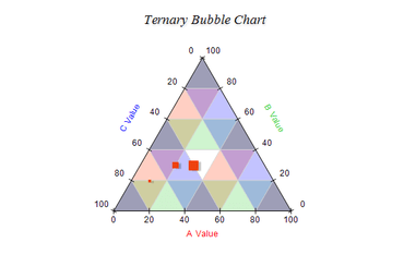
Ternary ChartAdds new Ternary Chart type.
Features
- New Ternary Chart Type - A Ternary chart plots three variables which sum to a constant.
- New Point Series Dropline - Drop lines extend from the X, Y, Z point to the chart wall. Optionally drop lines can extend to the axis min or max value or to a user specified value.
- New Bar Connect Lines - The Bar Series now support connector lines between adjacent bars.
- New Float Bar Connector Lines - The Float Bar Series now supports connector lines between adjacent bars.
- New Heat Map Contour Lines - The Heat Map Series now supports annotated contours. The user can specify the formatting of the contour value (elevation), the distance between labels along the contour, whether the labels orientation must follow the contour slope and whether the label should clip the contour line it annotates.
- Time Span Scale - This type of scale allows you to display time duration (time span). The duration is specified in time spans or ticks.
↧
↧
December 14, 2017, 4:31 am
DevExtremeMaintenance release includes several bug fixes.
Fixes
Data Visualization
- Documentation - The chart onInitialized help topic gives a link to the onContentReady event which does not exist on the chart.
- dxChart - A connector line of a label is not aligned properly.
- dxChart - In a certain configuration, labels overlap the chart title and the legend when resolveLabelOverlapping is set to 'shift'.
- dxChart - Incorrect zooming when dataSource has null points.
- dxChart - The stackedArea series with the second value axis doesn't work properly.
- dxChart displays a big gap between 2 and 3 hours for the Daylight Saving day on the Central European time zone.
- dxChart's TypeScript definitions for properties that accept an object or an array of objects are incorrect.
- dxLinearGauge - Widget is displayed when the value indicator's width/length is set to zero.
- dxVectorMap - The vectormaputils.parse method doesn't accept a response if statusText is empty.
Pivot Grid
- dxPivotGrid starts continuously re-rendering itself after expanding certain columns if the virtual scrolling is used.
DevExtreme Demos
- The "Advanced Master-Detail View" demo for ASP.NET Core does not work.
Data Grid
- A filter is not applied in the filter row when the "calculateFilterExpression" option is defined.
- A delayed option initialization scenario does not work correctly.
- Documentation - The code example in the calculateFilterExpression help section is not reliable.
- Grouping causes an unnecessary horizontal scrollbar.
- Tab navigation skips fields in the adaptive detail row on editing.
- The "Clear" button is incorrectly displayed for dxNumberBox and dxDateBox.
- The addColumn method does not add a banded column.
- The built-in edit form is cut off if the grid doesn't contain any records.
- The built-in keyboard is shown and then hidden when a user taps into the pager editor.
- The error message panel is still shown for a column editor in Batch mode when the column's validationRules message is set to "".
- Values of a date column with a certain custom format defined in the formatter are incorrectly shown in the exported document.
- dxDataGrid displays an unnecessary horizontal scrollbar if columnAutoWidth and columnHidingEnabled are enabled.
- dxDataGrid does not render group rows properly when a row template is defined in markup.
- dxDataGrid Filtering demo - The approach not supported by the grid's state storing feature is used for the "OrderDate" column's custom header filter items.
- dxDataGrid placed in dxResponsiveBox displays a different number of columns in IE and Chrome if Adaptability is enabled.
- dxDataGrid renders unexpected group headers of the edit form starting with 17.1.8 when the embedded dxForm configuration is defined.
- dxDateGrid - The noDataText text is not properly centered when it is long and wordWrapEnabled is enabled.
- The first item of the grid's edit form is focused on changing a value in the master cascading lookup.
- The grid does not re-apply search after its data source is changed.
DevExtreme Core
- dxChart - It is not possible to update the strips if there's a label on them.
- dxDataGrid doesn't automatically track changes in empty nested data fields in Angular.
- dxDataGrid throws the "Unable to process binding 'text'" error when adaptive rows are enabled under certain conditions.
- dxDataGrid/dxPivotGird - Incorrect object context in the width/height function.
- dxPopup - Defining titleTemplate throws an error in an Angular app.
- dxTextBox throws the "document.activeElement.scrollIntoViewIfNeeded is not a function" error on Android in a mobile Firefox.
- Templates nested in NamedTemplate are not rendered if there is only one control on the view (ASP.NET Core only).
- The "Unexpected identifier <" error is thrown when a DevExtreme MVC control is rendered in a template of another control under certain conditions.
- The getDataSource method for dxDropDownList is missing in TypeScript definitions.
- The TypeScript definition of the EndpointSelector class does not have a constructor.
- Typescript Definitions - The DataSource class does not accept a Store in the constructor.
DevExtreme Tools
- The Intellisense popup is duplicated when typing in a dxview file in VS2015.
Scheduler
- Vertical scroll does not work when crossScrollingEnabled and showAllDayPanel are true.
- An appointment's resource type is changed after dragging when the resource.allowMultiple option is enabled.
- Appointments are not displayed in timeline views when crossScrollingEnabled = true (FF, Edge, IE 9-11 ).
- Cells on the month view have incorrect height when the Angular approach is used.
- It is impossible to cancel an appointment's click or double click event for an appointment collector.
- It is possible to drag an appointment from an appointment collector even if the allowDragging option is set to false.
- shadeUntilCurrentTime does not work for all resources.
- shadeUntilCurrentTime in combination with crossScrollingEnabled disables scheduler cells.
- The "Done" button is always disabled even if custom validation in AppointmentAdding was not passed after the fix from T542841.
- The current time indicator is not rendered correctly in Week and Work Week views in IE11.
- Timeline views are not displayed when the height is not specified.
- Unable to navigate to the minimum date using the date navigator.
- dxScheduler does not allow selecting the max date.
- The Scheduler (in UTC) onAppointmentClick event handler is passing incorrect dates for appointmentData and targetedAppointmentData in recurrences.
Tree List
- Adding a child node to a node that does not have children does not work when the Add button is clicked the first time.
- dxTreeList initially renders only the first page if its data source is set asynchronously.
UI Widgets
- Documentation - The onContentReady link in the onInitialized topic leads to nowhere (dxTextBox, dxButton, etc.).
- dxCalendar uses incorrect month name abbreviations.
- dxDataGrid - "Cannot read property 'setSelectionRange' of undefined" when a custom format is used.
- dxDateBox - The jQueryEvent parameter is undefined if the "Clear" button is clicked.
- dxFileUploader with the defined "accept" option rejects a file with a capitalized extension.
- dxForm - It's impossible to access an item using itemOption inside a group or tab with multiple spaces in the caption.
- dxList - Selected item keys are cleared when a datasource is updated.
- dxLookup - searchExpr has an incorrect typescript definition.
- dxMap: An error appears on simultaneously changing the "markers" and "provider" options.
- dxMenu - The onSubmenuHidden event is raised multiple times.
- dxNumberBox - Sometimes it is impossible to delete some digits.
- dxNumberBox - Enter the decimal delimiter with the currency format when valueChangeEvent = "input keyup".
- dxNumberBox - It is impossible to edit a value if a percent is screened.
- dxNumberBox - It's impossible to clear a value if the mask contains '0' and Intl is registered.
- dxNumberBox - The onValueChanged event does not fire after typing digits.
- dxNumberBox shows a wrong decimal text for the 1.1 value when a mask is used.
- dxNumberBox throws the 'cannot read property toString of undefined' error when setting its value to undefined.
- dxSelectBox - It's impossible to clear the current value if fieldTemplate is used.
- dxTagBox - Selected tags have empty text if hideSelectedItems is "true".
- dxTagBox - The Custom Values functionality does not work correctly in Angular when tags are loaded via the dataSource option.
- dxTagBox - The filter argument of the CusomStore.load function is incorrectly merged when the hideSelectedItems option is enabled.
- dxTagBox - Widget fails to open in iOS when the multiline option is disabled.
- dxTextBox - The onValueChanged event handler contains the "event" parameter even if a value is changed programmatically.
- It is impossible to remove a dxTagBox item that has a value field equal to 0.
↧
December 14, 2017, 4:45 am
↧
December 14, 2017, 7:20 am
↧